3 things to avoid on your campsite website
So, you’ve got the 10 things you need on your campsite website, and the 5 things that are nice to have! This blog post is about the 3 things to avoid!
Take a look, and then visit your own website to see how many of them you’re guilty of! And if you need a hand fixing any of them, drop me a line.
First up…
1. Out of date information
If people spot out of date information on your website, it will raise questions about the validity of ALL of the information you’re providing and may put them off enquiring or booking.
This example is the “Latest News” on campsite featuring stories from 2019, 2021 and 2022. And the most recent one isn’t really a positive one to be highlighting. If you have out of date “news” on your website the best thing to do is probably remove it. Ask yourself whether you really have enough “news” to share from the site, and whether you have the resource to do that fairly regularly.

“Latest News” from 2022
The first greeting on this campsite website provides a Covid warning. A sure sign that the website isn’t being updated regularly and not a very warm or encouraging first impression.
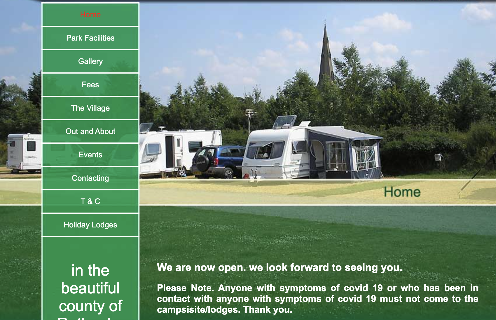
Covid warning on homepage
2. Overloading users with too many words
I’ve given you lots of things to include on your campsite website (see previous blog posts), but not everything needs it’s own page. You need to consider layout and design to make sure your website is easy to scan and navigate.
Use visual content to direct the eye and help users find what they need. Cotswold View do this really well (see below). They have a lot of information to communicate including camping pitches, pods and other accommodation along with on-site attractions and activities but by using icons and images, it’s easy to scan and explore.
Plus, it needs to work well on mobile devices too as no doubt many of your visitors will be using a handheld device to visit your site. You can find out exactly how many using Google Analytics (or another analytics service for your chosen CMS platform).
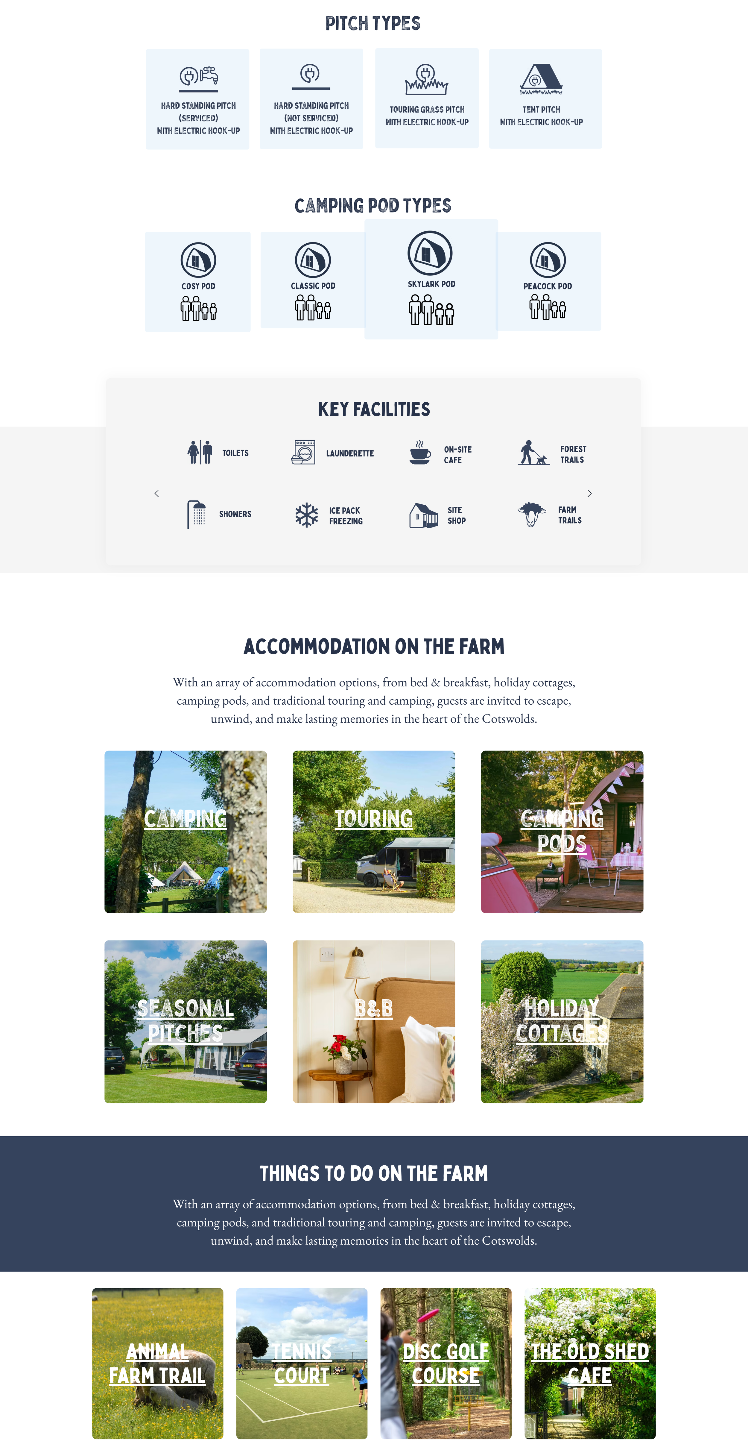
Cotswold View homepage
Whilst I’m not a website designer, I will work with web design and development agencies to deliver a visual design that is unique to you and gives your visitors what they need.
3. Poor accessibility
There are various accessibility standards and guidelines that should be followed for website content, the most well-known being the Web Content Accessibility Guidelines (WCAG). These are some of the most obvious issues found on campsite websites:
Poor colour contrast and drop shadows making words hard to read against the background
Images that don’t use alt text making it difficult for visually impaired people using screen readers
Links that say “click here” instead of something meaningful such as “book your pitch”
The image below from a campsite website has a few issues!
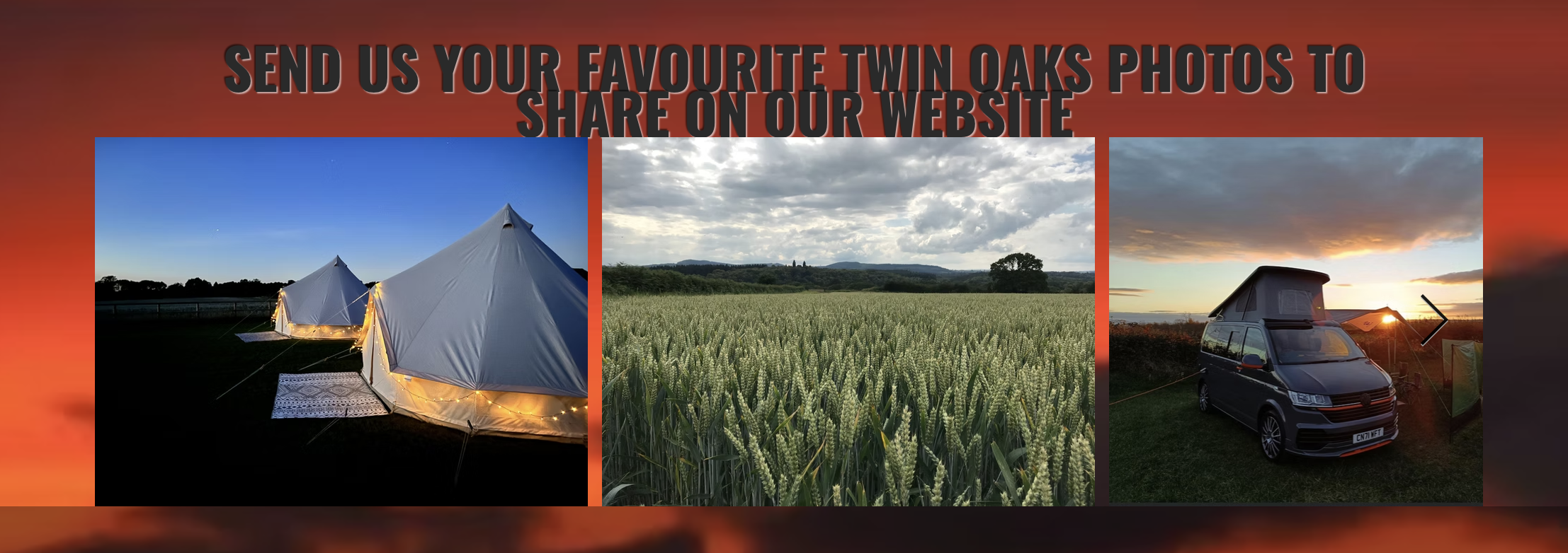
Drop shadows and poor colour contrast
Now pop over to your own website and see how you compare. If you need a bit of help working out how to address any issues, I’m happy to chat. Book a call with me to discuss your challenges and to see how I can help.